来源:俊欣
作者:关于数据分析与可视化
有粉丝问道说“是不是可以将这些动态的可视化图表保存成gif图”,小编立马就回复了说后面会写一篇相关的文章来介绍如何进行保存gif格式的文件。那么我们就开始进入主题,来谈一下Python当中的gif模块。
安装相关的模块
首先第一步的话我们需要安装相关的模块,通过pip命令来安装
pip install gif
另外由于gif模块之后会被当做是装饰器放在绘制可视化图表的函数上,主要我们依赖的还是Python当中绘制可视化图表的matplotlib、plotly、以及altair这些模块,因此我们还需要下面这几个库
pip install "gif[altair]"
pip install "gif[[matplotlib](https://www.cda.cn/map/matplotlib/)]"
pip install "gif[plotly]"
我们先来看gif和matplotlib模块的结合,我们先来看一个简单的例子,代码如下
import random from matplotlib
import pyplot as plt import gif

x = [random.randint(0, 100) for _ in range(100)]
y = [random.randint(0, 100) for _ in range(100)]

gif.options.[matplotlib](https://www.cda.cn/map/matplotlib/)["dpi"] = 300 @gif.fr ame def plot(i): xi = x[i*10:(i+1)*10]
    yi = y[i*10:(i+1)*10]
    plt.scatter(xi, yi)
    plt.xlim((0, 100))
    plt.ylim((0, 100))

fr ames = [] for i in range(10):
    fr ame = plot(i)
    fr ames.append(fr ame)

gif.save(fr ames, 'example.gif', duration=3.5, unit="s", between="startend")
output
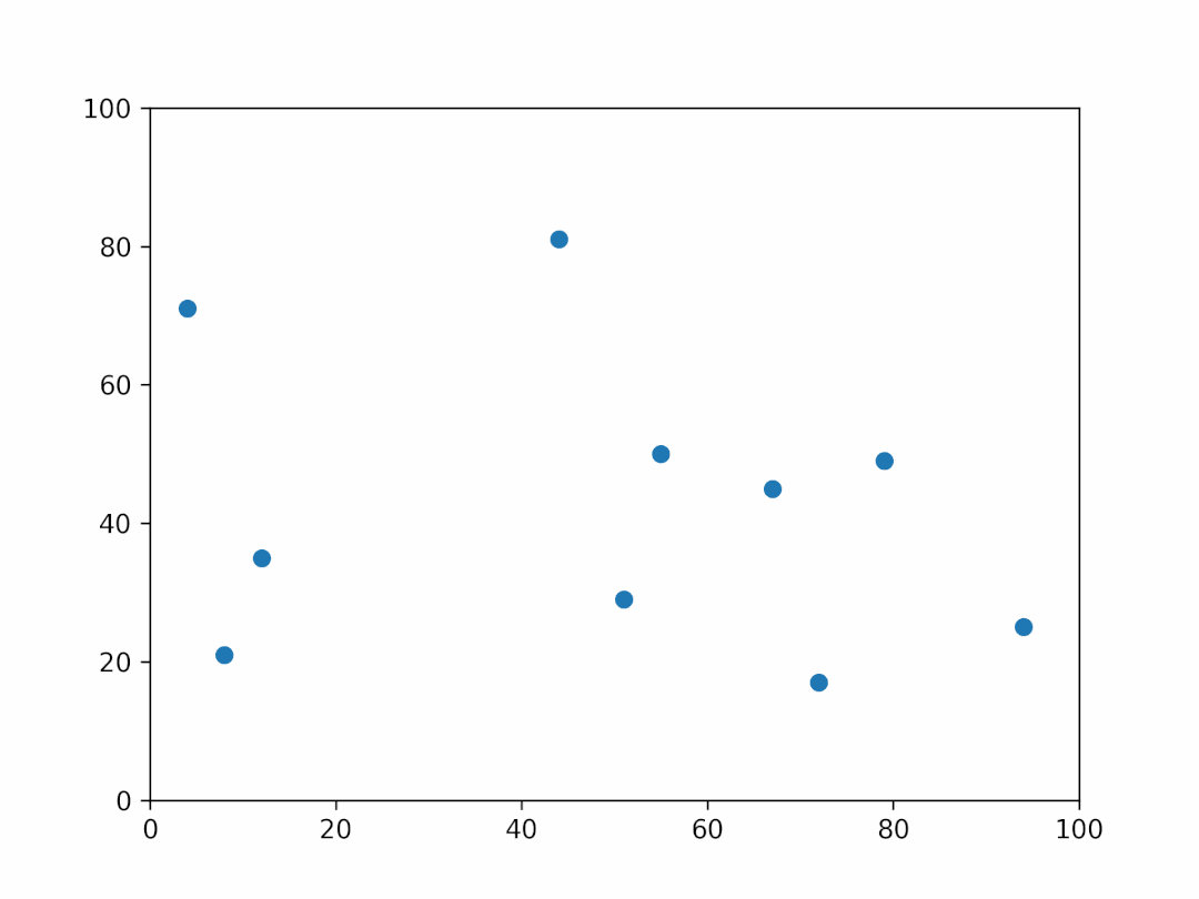
代码的逻辑并不难理解,首先我们需要定义一个函数来绘制图表并且带上gif装饰器,接着我们需要一个空的列表,通过for循环将绘制出来的对象放到这个空列表当中然后保存成gif格式的文件即可。
gif和plotly的结合
除了和matplotlib的联用之外,gif和plotly之间也可以结合起来用,代码如下
import random
import plotly.graph_ob jects as go
import pandas as pd
import gif

df = pd.Datafr ame({ 't': list(range(10)) * 10, 'x': [random.randint(0, 100) for _ in range(100)], 'y': [random.randint(0, 100) for _ in range(100)]
})

@gif.fr ame
def plot(i):
    d = df[df['t'] == i]
    fig = go.Figure()
    fig.add_trace(go.Scatter(
        x=d["x"],
        y=d["y"],
        mode="markers" ))
    fig.update_layout(width=500, height=300) return fig

fr ames = [] for i in range(10):
    fr ame = plot(i)
    fr ames.append(fr ame)

gif.save(fr ames, 'example_plotly.gif', duration=100)
output
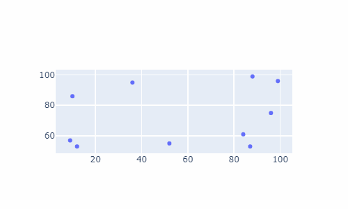
整体的代码逻辑和上面的相似,这里也就不做具体的说明了
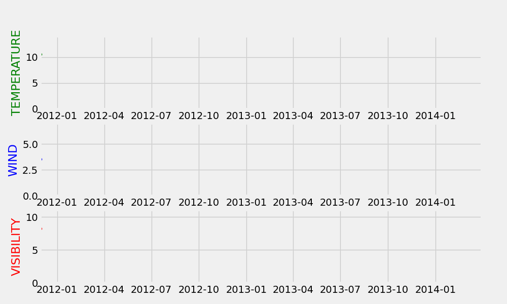
matplotlib多子图动态可视化
上面绘制出来的图表都是在单张图表当中进行的,那当然了我们还可以在多张子图中进行动态可视化的展示,代码如下
df = pd.read_csv('weather_hourly_darksky.csv')
df = df.rename(columns={"time": "date"})
@gif.fr ame def plot(df, date):
df = df.loc[df.index[0]:pd.Timestamp(date)]
fig, (ax1, ax2, ax3) = plt.subplots(3, figsize=(10, 6), dpi=100)
ax1.plot(df.temperature, marker='o', linestyle='--', linewidth=1, markersize=3, color='g')
maxi = round(df.temperature.max() + 3)
ax1.set_xlim([START, END])
ax1.set_ylim([0, maxi])
ax1.set_ylabel('TEMPERATURE', color='green')
ax2.plot(df.windSpeed, marker='o', linestyle='--', linewidth=1, markersize=3, color='b')
maxi = round(df.windSpeed.max() + 3)
ax2.set_xlim([START, END])
ax2.set_ylim([0, maxi])
ax2.set_ylabel('WIND', color='blue')
ax3.plot(df.visibility, marker='o', linestyle='--', linewidth=1, markersize=3, color='r')
maxi = round(df.visibility.max() + 3)
ax3.set_xlim([START, END])
ax3.set_ylim([0, maxi])
ax3.set_ylabel('VISIBILITY', color='red')
fr ames = [] for date in pd.date_range(start=df.index[0], end=df.index[-1], freq='1M'):
fr ame = plot(df, date)
fr ames.append(fr ame)
gif.save(fr ames, "文件名称.gif", duration=0.5, unit='s')
output
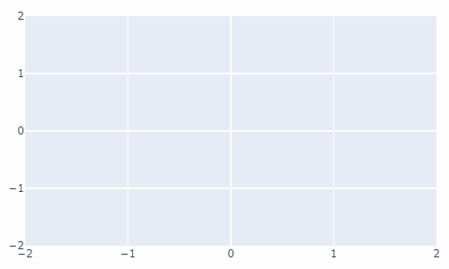
动态气泡图
最后我们用plotly模块来绘制一个动态的气泡图,代码如下
import gif
import plotly.graph_ob jects as go
import numpy as np
np.random.seed(1) N = 100
 x = np.random.rand(N)
 y = np.random.rand(N)
 colors = np.random.rand(N)
  sz = np.random.rand(N) * 30
   layout = go.Layout( xaxis={'range': [-2, 2]}, yaxis={'range': [-2, 2]}, margin=dict(l=10, r=10, t=10, b=10) )
    @gif.fr ame
def plot(i):
     fig = go.Figure(layout=layout)
      fig.add_trace(go.Scatter( x=x[:i], y=y[:i], mode="markers", marker=go.scatter.Marker( size=sz[:i], color=colors[:i], opacity=0.6, colorscale="Viridis" ) ))
       fig.update_layout(width=500, height=300)
return fig
fr ames = []
for i in range(100):
    fr ame = plot(i)
    fr ames.append(fr ame)
    gif.save(fr ames, "bubble.gif")
output


 扫码加好友,拉您进群
 全部版块
全部版块 我的主页
我的主页

 收藏
收藏


