Scagnostics, scatterplot diagnostics, was discovered by John and Paul Tukey and later popularized by Leland Wilkinson in Graph-Theoretic Scagnostics (2005). These analyses were redefined in High-Dimensional Visual Analytics: Interactive Exploration Guided by Pairwise Views of Point Distributions (2006).
The beauty of scagnostics is the ability to visually explore a dataset. JMP has the inherent feature called Scatterplot Matrix (SPLOM), which allows the user to simultaneously compare the relationship between many pairs of variables.
However, SPLOMs lose their effectiveness when the number of variables get too large. Figure 1 shows a portion of the SPLOM report.
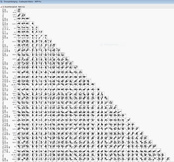
Figure 1. SPLOM for Drosophila Aging Data
We look to explore the Drosophila Aging data with 48 observations and 100 numeric variables. Notice in Figure 1 the substantial number of variables in this dataset. This can be overwhelm and our ability to visually observe the data is flawed. In Figure 1, only about 15% of the actual SPLOM is shown. In a world where our datasets are growing every day, it is imperative to be able to extract meaningful information from the relationship between our variables. That’s where scagnostics comes in! Scagnostics assesses five aspects of scatterplots: outliers, shape, trend, density, and coherence.
This summer, I had the privilege of writing a JMP add-in (downloaded here with a free SAS profile) that allows the user to interactively explore data using nine graph-theoretic measures. The add-in combines three current features of JMP: Distribution, Scatterplot Matrix, and Graph Builder. Each point in the scatterplot represents a 2D scatterplot. When the user selects a point in the scatterplot matrix in the bottom left, Graph Builder shows the respective scatterplot for the two variable in the bottom right.
As an example, one point has already been selected in the SPLOM in Figure 2. The corresponding variables are log2in_Tsp42Ej and log2in_CG6372. For this pair of variables, there are two discernible clusters of data. This is noted in a high Clumpy value.
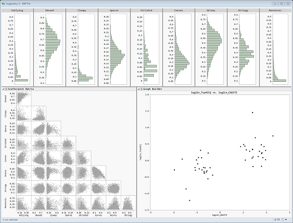
Figure 2. Scagnostics for Drosophila Aging Data – Clumpy Example
Figure 3 below shows us that if we select a point with a high monotonic value, we can observe a clear association and a strong linear relationship between the variables, log2in_alpha_Cat and log2in_CG3430der.
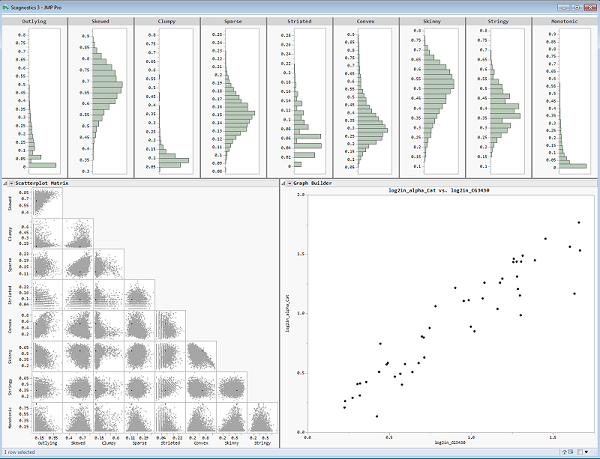
Figure 3. Scagnostics for Drosophila Aging Data – Monotonic Example
Another key aspect of Scagnostics is outlier detection. Review the Graph Builder plot in Figure 4 below. When we inspect the two variables log2in_CG18178 and log2in_BcDNA_GH04120, we see two data points that visually appear to be outliers. Results with a substantial outlying value, as well as a relatively high skewed value, support the notion that this pair of variables has major outliers overall.
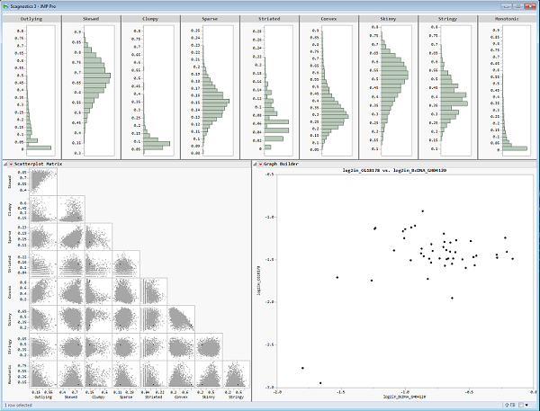
Figure 4. Scagnostics for Drosophila Aging Data – Outlying Example
As we compare the original SPLOM report in Figure 1 to the recursive SPLOM and Graph Builder reports in Figures 2, 3, and 4, we uncover much more informative and enlightening analyses.
Now it’s time to download the Scagnostics add-in and begin your own exploration!


 扫码加好友,拉您进群
 全部版块
全部版块 我的主页
我的主页

 收藏
收藏


 [victory]