16.1 R 中的四种图形系统
基础图形函数可自动调用,而grid和lattice函数的调用必须要加载相应的包(如library(lattice))。要调用ggplot2函数需下载并安装该包(install.packages("ggplot2")),第一次使用前还要进行加载(library(ggplot2))。

16.2 lattice 包
lattice包为单变量和多变量数据的可视化提供了一个全面的图形系统。在一个或多个其他变量的条件下,栅栏图形展示某个变量的分布或与其他变量间的关系。
> library(lattice)
> histogram(~height|voice.part,data=singer,main="Distributionof heights by voice pitch",xlab="height (inches)")

lattice包提供了丰富的函数,可生成单变量图形(点图、核密度图、直方图、柱状图和箱线图)、双变量图形(散点图、带状图和平行箱线图)和多变量图形(三维图和散点图矩阵)。各种高级绘图函数都服从以下格式:
graph_function(formula,data=,options)
graph_function是某个函数。
formula指定要展示的变量和条件变量。
data指定一个数据框。
options是逗号分隔参数,用来修改图形的内容、摆放方式和标注。

lattice中高级绘图函数的常见选项

lattice绘图示例:
> gear<-factor(gear,levels=c(3,4,5),labels=c("3 gears","4 gears","5 gears"))> cyl<-factor(cyl,levels=c(4,6,8),labels=c("4 cylinders","6 cylinders","8 cylinders"))> densityplot(~mpg,main="Density plot",xlab="miles per gallon")
> densityplot(~mpg | cyl,main="Density plot by number of cylinders",xlab="miles per gallon")
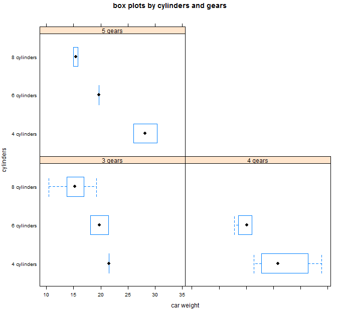
> bwplot(cyl~mpg|gear,main="box plots by cylinders and gears",xlab="car weight",ylab="cylinders")
> xyplot(mpg~wt|cyl*gear,main="scatter plots by cylinders and gears",xlab="car weight",ylab="miles per gallon")
> cloud(mpg~wt*qsec|cyl,main="d scatter plots by cylinders")
> dotplot(cyl~mpg|gear,main="dot plots by number of gears and cylinders",xlab="miles per gallon")

> splom(mtcars[c(1,4,5,6)],main="scatter plot matrix for mtcars data")

16.2.1 条件变量
> myshingle<-equal.count(x,number=#,overlap=proportion)将会把连续型变量x分割到#区间中,重叠度为proportion,每个数值范围内的观测数相等,并返回为一个变量myshingle(或类shingle)。输出或者绘制该对象(如plot(myshingle))将会展示瓦块区间。一旦一个连续型变量被转换为一个瓦块,你便可以将它作为一个条件变量使用。
> displacement<-equal.count(mtcars$disp,number=3,overlap=0)> xyplot(mpg~wt|displacement,data=mtcars,+ main="miles per gallon vs weight by engine displacement",+ xlab="weight",ylab="miles per gallon",+ layout=c(3,1),aspect=1.5)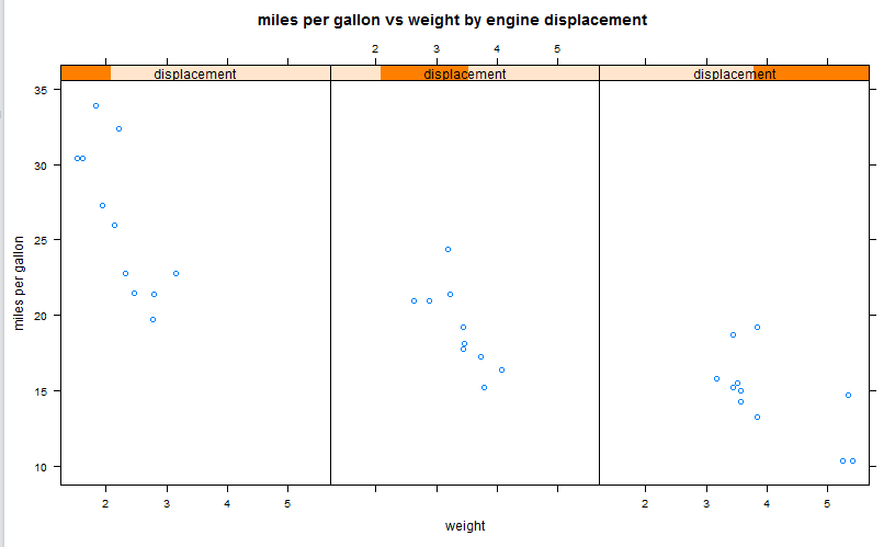
16.2.2 面板函数
每个高级绘图函数都调用了一个默认的函数来绘制面板。这些默认的函数服从如下命名惯例:panel.graph_function,其中graph_function是该水平绘图函数。如:xyplot(mpg~wt|displacement,data=mtcars)也可以写成:xyplot(mpg~wt|displacement,data=mtcars,panel=panel.xyplot)。自定义面板函数的xyplot:
>displacement<-equal.count(mtcars$disp,number=3,overlap=0)
> mypanel<-function(x,y){
+ panel.xyplot(x,y,pch=19)
+ panel.rug(x,y)
+ panel.grid(h=-1,v=-1)
+ panel.lmline(x,y,col="red",wd=1,lty=2)
+ }
>xyplot(mpg~wt|displacement,data=mtcars,
+ layout=c(3,1),
+ aspect=1.5,
+ main="miles per gallon vs weightby engine displacement",
+ xlab="weight",ylab="miles per gallon",
+ pannel=mypanel)

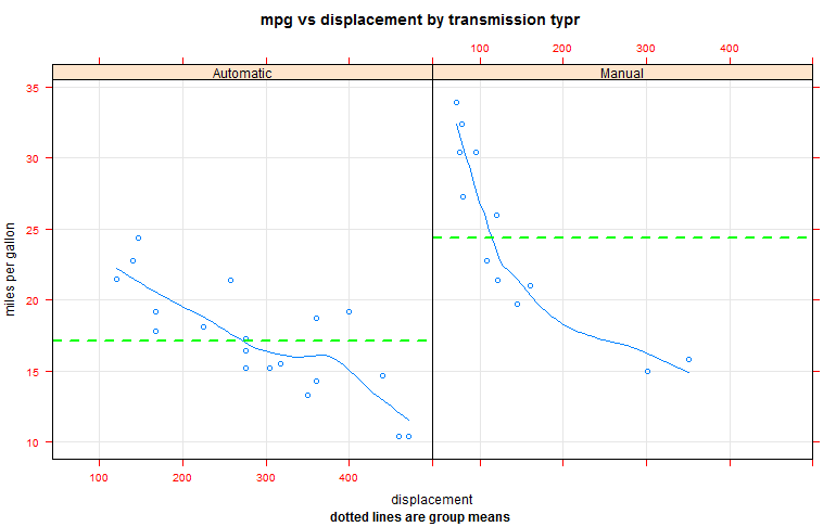
自定义面板函数和额外选项的xyplot
> library(lattice)
>mtcars$transmission<-factor(mtcars$am,levels=c(0,1),
+ labels=c("Automatic","Manual"))
> panel.smoother<-function(x,y){
+ panel.grid(h=-1,v=-1)
+ panel.xyplot(x,y)
+ panel.loess(x,y)
+ panel.abline(h=mean(y),lwd=2,lty=2,col="green")
+ }
> xyplot(mpg~disp|transmission,data=mtcars,
+ scales=list(cex=.8,col="red"),
+ panel=panel.smoother,
+ xlab="displacement",ylab="miles per gallon",
+ main="mpg vs displacement bytransmission typr",
+ sub="dotted lines are group means",aspect=1)


 扫码加好友,拉您进群
 全部版块
全部版块 我的主页
我的主页

 收藏
收藏


