本帖隐藏的内容
When working with data it is helpful to build a correlation matrix to describe data and the associations between variables. In this article, you learn how to use visualizations for correlation matrices in Python.
Read packages into R libraryFirst we need to read the packages into the Python library:
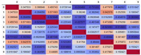
Visualizations for correlation matrixFirst let us make a correlation matrix table:
The above table is quite hard to read and you end up with a lot of correlation numbers that is hard to interpret. Let us make them into a correlation matrix visualization:
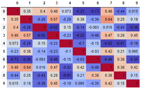
The above coding gives us the following correlation matrix visualization:
It is possible to limit the digits with the following code:
The above coding gives us the following correlation matrix visualization:
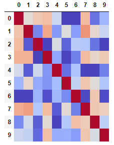
It is also possible not to display digits:
The above coding gives us the following correlation matrix visualization:
It is also possible to use another colormap:
The above coding gives us the following correlation matrix visualization:

And also to highlight numbers:
The above coding gives us the following correlation matrix visualization:

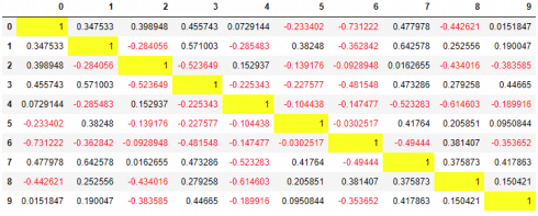
It is also possible to highlight large numbers and color negative number red with the following code:
The above coding gives us the following correlation matrix:


 扫码加好友,拉您进群
 全部版块
全部版块 我的主页
我的主页

 收藏
收藏


