4.3.3 Sieve diagram
How does income relate to the education levels? Do graduates get paid more than non-grads?
Let’s visualize using a sieve diagram.
Click and drag from the “File” widget and search for “Sieve Diagram”.

Once you place it, double click on it and select your axes!

This plot divides the sections of distribution into 4 bins. The sections can be investigated by hovering the mouse over it.
For example, graduates and non-graduates are divided 78% by 22%. Then subdivisions of 25% each are made by splitting the applicant incomes into 4 equal groups. Here the task for you, generate insight from these charts and share in the comment section.
Let’s now look at how to clean our data to start building our model.
5. How do you clean your data?Here for cleaning purpose, we will impute missing values. Imputation is a very important step in understanding and making the best use of our data.
Click on the “File” widget and drag to find the “Impute” widget.

When you double click on the widget after placing it, you will see that there are a variety of imputation methods you can use. You can also use default methods or choose individual methods for each class separately.

Here, I have selected the default method to be Average for numerical values and Most Frequent for text based values (categorical).
You can select from a variety of imputations like:
- Distinct Value
- Random Values
- Remove the rows with missing values
- Model-Based
The other things you can include in your approach to training your model are Feature Extraction and Generation.For further understanding, follow this article on Data Exploration and Feature Engineering (https://www.analyticsvidhya.com/blog/2016/01/guide-data-exploration/)
6. Training your First ModelBeginning with the basics, we will first train a linear model encompassing all the features just to understand how to select and build models.
Step 1: First, we need to set a target variable to apply Logistic Regression on it.
Step 2: Go to the “File” widget and double click it.
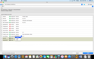
Step 3: Now, double click on the Loan_Status column and select it as the target variable. Click Apply.
Step 4: Once we have set our target variable, find the clean data from the “Impute” widget as follows and place the “Logistic Regression” widget.

Step 5: Double click the widget and select the type of regularization you want to perform.
- Ridge Regression:
- Performs L2 regularization, i.e. adds penalty equivalent to square of the magnitude of coefficients
- Minimization objective = LS Obj + α * (sum of square of coefficients)
- Lasso Regression:
- Performs L1 regularization, i.e. adds penalty equivalent to absolute value of the magnitude of coefficients
- Minimization objective = LS Obj + α * (sum of absolute value of coefficients)
For a better understanding of these, please visit the link about Ridge and Lasso regressions https://www.analyticsvidhya.com/blog/2016/01/complete-tutorial-ridge-lasso-regression-python/
I have chosen Ridge for my analysis, you are free to choose between the two.
Step 6: Next, click on the “Impute” or the “Logistic Regression” widget and find the “Test and Score” widget. Make sure you connect both the data and the model to the testing widget.
 Step 7: Now, click on the “Test and Score” widget to see how well your model is doing.

Step 8: To visualize the results better, drag and drop from the “Test and Score” widget to fin d “Confusion Matrix”.

Step 9: Once you’ve placed it, click on it to visualize your findings!

This way, you can test out different models and see how accurately they perform.
Let’s try to evaluate, how a Random Forest would do? Change the modeling method to Random Forest and look at the confusion matrix.

Looks decent, but the Logistic Regression performed better.
We can try again with a Support Vector Machine.

Better than the Random Forest, but still not as good as the Logistic Regression model.
Sometimes the simpler methods are the better ones, isn’t it?
This is how your final workflow would look after you are done with the complete process.

For people who wish to work in groups, you can also export your workflows and send it to friends who can work alongside you!

The resulting file is of the (.ows) extension and can be opened in any other Orange setup.
End NotesOrange is a platform that can be used for almost any kind of analysis but most importantly, for beautiful and easy visuals. In this article, we explored how to visualize a dataset. Predictive modeling was undertaken as well, using a logistic regression predictor, SVM, and a random forest predictor to find loan statuses for each person accordingly.
Hope this tutorial has helped you figure out aspects of the problem that you might not have understood or missed out on before. It is very important to understand the data science pipeline and the steps we take to train a model, and this should surely help you build better predictive models soon!


 扫码加好友,拉您进群
 全部版块
全部版块 我的主页
我的主页

 收藏
收藏